A remarkably small idea that could reduce distracted driving A remarkably small idea that could reduce distracted driving
There are at least two ways to think about the problem of distracted driving. We could try to get people to cut down on all of the stuff that's distracting them -- texting, fielding phone calls, fiddling with in-car navigation screens at 50 miles an hour. Or we could acknowledge that drivers will probably keep doing all of those things anyway and try to mitigate the harm.
Cars, after all, have only grown more technologically sophisticated, more filled with screens and media and material to read. At this point, realistically, there's no going back to the days of basic dashboards and radio dials.
"There?s always been some type of labeling in cars," says Carl Crossgrove, a senior designer with the typeface design firm Monotype. "But we're on the cusp of a huge jump in terms of the potential for distraction in driving because so many car-makers are about ready to launch models with touch screens, navigation, infotainment screens."
Consider this 17-inch touch screen on the Tesla S, practically a MacBook Pro mounted in the cabin.
"This is sort of unknown territory," Crossgrove says.
Meanwhile, aging demographics in America mean that drivers will be growing older, their eyesight diminishing along the way. But what if, at the nexus of these two trends, we could at least reduce the time it takes us to do the things that are distracting us.
Two years ago, the MIT AgeLab and Monotype began to study whether more legible typefaces could make a difference in in-car media. For men, at least, the answer has been yes. In driving simulations run by the lab, male drivers took their eyes off the road for less time when the text on a small navigation screen appeared in a typeface from what's known as the humanist genre. The difference between humanist and grotesque typefaces amounted to the equivalent of turning away from the road over a distance of 50 feet at highway speeds.
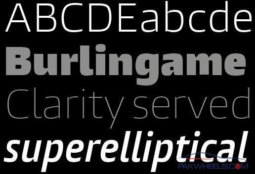
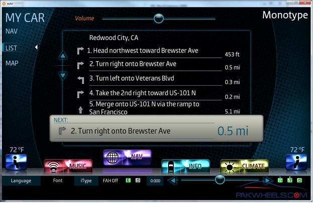
"That took what we know intuitively as type designers and actually put some scientific backbone on it," says Steve Matteson, a creative type director at Monotype who worked on the original study. Since then, Monotype has been working on a new typeface, called Burlingame, which it's releasing this week as the first designed specifically with distracted driving in mind. It's meant for use by auto manufacturers in in-car displays, or in the myriad devices we bring with us whenever we enter a car:
Typography is not typically in the realm of transportation policy, and for a layman it's a little hard to appreciate the subtle differences. But there is some precedent for this idea: In the early 2000s, the Federal Highway Administration worked with typeface designers and researchers at Penn State to craft and test the Clearview typeface that's now voluntarily used by states on a lot of highway signage. In studies, drivers have been able to recognize Clearview signs at night from 20 percent farther away than standard signage.
Burlingame adapts this same goal of clarity for a digital medium, and for a very different kind of reading: Road signs are already in our field of vision while we're driving, but in-car digital text requires that we glance aside for small snatches of time.
"I'm starting to wonder if we don't need a new word, or more than one word, for what we?re calling "reading" Crossgrove says, "because of the fact that we do something with text and information that's picking at it, that's grabbing a little bit of information."
To appreciate how Burlingame might help you do that very specific kind of reading, it's helpful to refer back to the original AgeLab study. With a lot of typefaces, your B and your 8 become indistinguishable (not the typeface The Post uses!). Same with your o's and c's. Characters can be confused with each other, or are hard to separate when they're side-by-side. Here, the grotesque style is in the top line, the humanist in the bottom one:
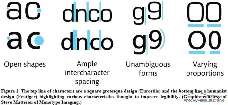
This picture explains why the open "aperture" of a letter matters:
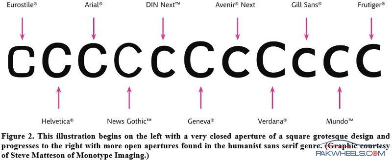
The AgeLab study used the typeface at right, Frutiger. Burlingame is a further variation in that direction, building both on previous typefaces that have been designed for clarity, for instance, in the phone book, or for legibility on digital screens (as Verdana was). In a real-world setting -- Monotype has already been in talks with an auto manufacturer -- Burlingame would like this:
Tweaking the aperture in the typeface used in the navigation system in your car may not have quite the safety impact of regulating the technology, or your use of it, entirely. But small gains aren't insignificant in a realm where attention is measured -- and crashes are averted -- in fractions of a second.


